
Introduction
Back in the early days of the internet
Back in the early days of the internet, websites were designed for desktop computers first. Mobile phones were considered secondary. But times have changed. Today, more than 70% of searches come from mobile devices. Google recognized this trend and introduced Mobile-First Indexing. Simply put, it means Google now uses the mobile version of your website as the primary version for ranking and indexing. If your site works well on mobile, you have a better chance of ranking higher.
Mobile-First Indexing is not optional anymore
Mobile-First Indexing is not optional anymore; it’s the standard. A website that looks beautiful on desktop but fails on mobile can lose significant visibility. Poor mobile experience leads to higher bounce rates, lower engagement, and weaker rankings. On the other hand, a responsive, mobile-optimized website can improve SEO, user satisfaction, and conversions. For businesses, bloggers, and even students building online platforms, understanding Mobile-First Indexing is essential in 2025.
This guide will explain what Mobile-First Indexing is, why it matters for SEO, how you can test your website’s mobile-friendliness, and the best practices you should adopt. By the end of this article, you’ll have a clear roadmap to make your website mobile-ready and future-proof.
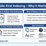
What is Mobile-First Indexing?
Mobile-First Indexing means that Google primarily uses the mobile version of a website for indexing and ranking. If your site has both desktop and mobile versions, Google will prefer the mobile one.
Example: If your desktop site is perfect but the mobile version is broken, Google will consider the broken mobile version as the main source, which can harm your SEO performance.
Why It Matters in SEO
-
User Behavior: More than two-thirds of users browse from mobile devices.
-
Google Priority: Google’s algorithm now favors mobile sites for crawling and indexing.
-
Better Rankings: Mobile-friendly sites often rank higher, especially for local searches.
-
User Experience: A smooth mobile interface reduces bounce rates and increases time spent on site.
Case Study: In 2024, a fashion e-commerce store redesigned its mobile site to be responsive and fast. Within 3 months, its organic traffic increased by 45% and mobile sales grew by 60%.
How to Test Mobile-Friendliness
Google provides free tools to check your site’s mobile readiness:
-
Google Mobile-Friendly Test: Enter your URL to see how Google views your site on mobile.
-
Google Search Console: Shows issues related to mobile usability.
-
PageSpeed Insights: Tests both speed and mobile performance.
If your site fails these tests, you may be losing valuable traffic.
Best Practices for Mobile-First Indexing
-
Responsive Design: Use layouts that adapt to any screen size.
-
Consistent Content: Ensure mobile and desktop versions have the same text, images, and structured data.
-
Optimize Speed: Compress images, reduce server response time, and enable caching.
-
Avoid Pop-ups: Intrusive interstitials can hurt rankings.
-
Readable Fonts: Text should be clear without zooming.
-
Test Regularly: Use Google tools to monitor performance.

Student Section
Summary
Mobile-First Indexing is Google’s way of prioritizing the mobile version of websites for ranking and indexing. Since most searches now come from smartphones, this shift ensures users get the best mobile experience. If your site is not mobile-friendly, you risk losing rankings and traffic, no matter how strong your desktop version is. To stay competitive, websites must adopt responsive design, optimize speed, and maintain consistency between desktop and mobile versions. Google’s tools like Mobile-Friendly Test and PageSpeed Insights help identify issues. For students and beginners, mastering Mobile-First Indexing is crucial to build future-proof websites.
Quiz
-
What does Mobile-First Indexing mean?
-
Why is mobile traffic more important than desktop traffic?
-
Which Google tool checks mobile-friendliness?
-
Name two best practices for mobile optimization.
-
How does poor mobile design affect SEO?
Difficult Words Table:
| Word | Meaning in Urdu |
|---|---|
| Indexing | فہرست میں شامل کرنا |
| Responsive Design | ہر ڈیوائس کے حساب سے ڈیزائن |
| Interstitials | درمیان میں آنے والے پاپ اپ |
| Bounce Rate | ویب سائٹ جلدی چھوڑنے کا تناسب |
| Usability | استعمال میں آسانی |
FAQs
Q1: Do I need a separate mobile site for Mobile-First Indexing?
No, a responsive design works best.
Q2: What if my desktop site is better than my mobile site?
Google will still use the mobile version for ranking.
Q3: How fast should a mobile site load?
Ideally under 3 seconds for best SEO results.
Q4: Is Mobile-First Indexing only for Google?
Primarily yes, but other search engines also consider mobile optimization.
Read More Section
People are also reading: